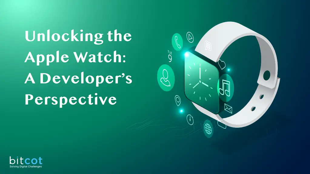
The Apple Watch is a revolutionary wearable device that goes beyond simply telling time. It is a personal health tracker, communication hub, and canvas for custom apps. Its significance lies in its seamless blend of hardware and software, offering users a versatile experience that extends beyond traditional timekeeping.
The Apple Watch is packed with features, from fitness tracking and heart rate monitoring to quick access to messages and notifications. However, its true potential comes to life with WatchOS apps. These apps allow developers to tap into the device’s capabilities, creating tailored experiences for users.
In this guide, we will take you through the process of crafting your own WatchOS app. We will delve into development and design principles, equipping you to enhance the lives of Apple Watch users and make the most of this remarkable wearable.
Key Characteristics of Effective WatchOs App

- Simplicity: Keep the design simple and uncluttered. Use minimalistic layouts and avoid overcrowding the small screen. Prioritize the most important information or actions to make them easily accessible. (You Can’t Fit Everything In a Small Screen )
- Touch-Friendly Elements: Design interactive elements, such as buttons and icons, to be touch-friendly. Ensure there’s enough spacing between elements to prevent accidental taps. Larger touch targets make navigation easier on the small screen. (It should have proper Feedback while Touching )
- Adaptability: Design the app to adapt to different Apple Watch sizes and orientations. Ensure that the app looks and functions well on both square and round watch faces.
- Engaging Animations: Use subtle and purposeful animations to guide users, provide feedback, and enhance the overall user experience. Avoid excessive animations that may slow down the app or become distracting. (So that User can Stay)
- Color Palette: Choose a cohesive color palette that aligns with the app’s branding and the Apple Watch’s design language. Ensure that colors are easily distinguishable and accessible.
- Complication Design: If your app includes complications, design them to provide meaningful information at a glance. Make use of color, icons, and data visualization to convey information efficiently. (Only Meaningful Info at a Glance)
- Customization: Allow users to customize aspects of the app’s design, such as watch face complications or color themes. Personalisation can enhance user engagement.
- Accessibility: Design with accessibility in mind. Ensure that all text is readable and that there is adequate contrast between text and background. Or the Icon Can Communicate.
- Brand Identity: If applicable, incorporate your app’s brand identity into the design. Use the app’s logo and branding elements consistently throughout the interface.
Building an WatchOs App: A Step-by-Step Guide
- Open Xcode.
- Click on “File” > “New” > “Project.”
- In the template selection window, choose “watchOS App” under “Apple Watch.”
- Click “Next” and configure your project settings.


Designing Your User Interface with Swift
ContentView for watchOS Weather App
In a watchOS app, the ContentView might look similar to its iOS counterpart, but you need to consider the limited screen space and the fact that users interact primarily through touch and the digital crown. It’s essential to optimize the layout for smaller screens, and you should ensure that navigation and interaction elements are touch-friendly and easy to use with the digital crown. In the Below Example we are Taking Example of the Weather App for WatchOS


CurrentForecastView for watchOS
For watchOS, the CurrentForecastView should have a layout optimized for a smaller screen. The use of VStack is appropriate for stacking elements vertically. However, make sure that text and images are appropriately sized for readability on the watch’s display.

HourlyForecastView for watchOS
For the HourlyForecastView in a watchOS app, we make several adjustments to ensure a better user experience on a smaller screen. We use a larger font for the time to make it more prominent, and we use smaller fonts for temperature and weather descriptions to save space. Additionally, we adjust the image scale to keep the layout balanced and improve readability.

DailyForecastView for watchOS
Similar to the HourlyForecastView, the DailyForecastView for a watchOS app features adjustments to accommodate the smaller screen. We use a larger font for the day of the week, smaller fonts for temperature ranges and weather descriptions, and adjust the image scale for better balance and readability. In both views, it’s crucial to optimize the layout for the limited screen space and ensure that the content remains user-friendly and accessible on an Apple Watch.

Conclusion
When creating a watchOS app, always keep in mind the limitations and unique characteristics of the Apple Watch. Design your user interface to be clear, concise, and easy to navigate with touch and the digital crown. Additionally, make sure to test your app on an actual Apple Watch to ensure a great user experience.
Further Learning Resources