
The transition to React Server Components (RSC) and the Next.js App Router represents the most significant architectural shift in the React ecosystem since the introduction of Hooks in 2019.
For nearly a decade, frontend architecture was predicated on a client-centric model where the browser bore the brunt of hydration, routing, and data fetching. The paradigm has now inverted. We have moved from a purely logical separation of concerns, view versus business logic, to a physical separation of infrastructure, server versus client environment.
This report provides an exhaustive, architect-level analysis of how to build reusable, scalable, and high-performance applications in this new landscape. It is not merely a collection of tutorials but a deep investigation into the structural and diverse implications of the App Router.
We will explore the convergence of Headless UI principles with atomic design, the transformation of polymorphic components from TypeScript-heavy abstractions to elegant slot-based patterns, and the implementation of high-fidelity UX patterns, such as intercepting routes, optimistic UI updates, and infinite scrolling, leveraging the distinct capabilities of Server Actions.
By synthesizing insights from current industry standards and technical documentation, this document serves as a comprehensive blueprint for technical leads, principal engineers, and software architects aiming to construct maintainable applications that do not merely survive but thrive in the Next.js ecosystem.
We will dissect the granular details of component composition, examine the “fractal” nature of modern project structures, and provide concrete implementation strategies for patterns that define the modern web experience.
1. The Paradigm Shift: From logical to Physical Separation
To understand modern reusability, one must first dismantle the mental models of the past. In the traditional Single Page Application (SPA) era, “reusability” was often synonymous with “abstraction.” We created Higher-Order Components (HOCs) and complex render-prop patterns to share logic because everything ran in the same environment: the browser’s main thread.
The Next.js App Router introduces a physical boundary that fundamentally alters these rules: the Network Boundary. A component is no longer just a function that returns UI; it is a unit of execution bound to a specific environment.
1.1 The Bifurcation of the Component Model
The React application is now a hybrid organism composed of two distinct species of components, each with its own lifecycle, constraints, and capabilities.
1.1.1 Server Components: The Data-Rich Skeleton
By default, components in the app directory are React Server Components (RSC). They execute exclusively on the server, have direct access to backend resources (databases, internal microservices, file systems), and never hydrate on the client.
- Reusability Context: Reusability here is defined by data independence. A reusable Server Component (e.g., <ProductList category=”shoes” />) encapsulates its own data fetching. It is not a “dumb” UI component waiting for props; it is a self-contained feature.
- The Zero-Bundle Cost: The code for a Server Component is not included in the JavaScript bundle sent to the browser. This allows architects to use heavy libraries (like Markdown parsers or date formatting utilities) inside reusable components without penalizing the user’s Time to Interactive (TTI).
1.1.2 Client Components: The Interactive Skin
Client Components are the direct descendants of the traditional React components we have written for years. They are opted-in via the “use client” directive.
- Reusability Context: These components are reusable interactive units. They manage state (useState), handle user events (onClick), and interface with browser APIs (window, localStorage).
- The Hydration Cost: Unlike Server Components, these contribute directly to bundle size. Therefore, reusability strategies here must focus on keeping these components as small “leaves” in the component tree, pushing logic up to the server or down to headless hooks.
1.2 The “Children” Prop as the Bridge
The most critical pattern for reusability in this hybrid world is Composition. A common misconception is that you cannot import a Server Component into a Client Component. While you cannot import it directly (because the Client Component file runs in the browser), you can pass a Server Component as a child (or prop) to a Client Component.
This pattern effectively punches a hole through the client boundary, allowing server-rendered HTML to exist inside an interactive client wrapper without forcing the inner content to become client-side logic.
Architectural implication: Reusable Client Components (like Modals, Collapsible Panels, or Context Providers) should almost always accept children rather than defining their content internally. This preserves the server-rendering capabilities of the content they wrap.
2. Structural Foundations: Organizing for Scale
Before discussing the internal code of components, we must address the macroscopic organization of the codebase. A disorganized file structure in Next.js leads to “Colocation Collapse,” where components are coupled to specific routes, making them impossible to reuse across the application.
2.1 The Conflict: Next.js Routing vs. Domain Logic
The Next.js App Router enforces a strict file-system-based routing mechanism. Folders inside app/ define the URL structure (app/dashboard/settings/page.tsx becomes /dashboard/settings).
The Problem: If developers place their reusable components, business logic, and utility functions directly inside these route folders, the application becomes tightly coupled to the URL structure. Moving a feature from /dashboard to /settings becomes a refactoring nightmare. Furthermore, deep nesting makes imports unwieldy (../../../components/button).
2.2 Methodology A: Atomic Design
One historical approach to organizing components is Atomic Design, which categorizes components based on their complexity: Atoms, Molecules, Organisms, Templates, and Pages.
- Atoms: Basic building blocks (Buttons, Inputs, Labels). These are typically Client Components in Next.js because they require interaction handlers.
- Molecules: Simple groups (Search Bar = Input + Button).
- Organisms: Complex sections (Header, Product Grid). This is often where the Server/Client boundary blurs. An organism might be a Server Component that fetches data and passes it to molecule children.
- Templates & Pages: These map directly to the Next.js layout.tsx and page.tsx files.
Critique: While Atomic Design is excellent for visual consistency, it struggles with domain complexity. A “UserCard” organism and a “ProductCard” organism are structurally similar but semantically distinct. Grouping them together in components/organisms dilutes the domain boundaries.
2.3 Methodology B: Feature-Sliced Design (FSD)
For large-scale Next.js applications, Feature-Sliced Design (FSD) offers a superior model for reusability. FSD partitions the codebase by business domain rather than technical function.
The FSD Hierarchy:
- Shared: Highly reusable, domain-agnostic UI kit (Buttons, Icons) and generic utilities. This is where your “Design System” lives.
- Entities: Business models (e.g., User, Post, Comment). Components here are reusable across features but tied to a specific domain entity (e.g., UserAvatar).
- Features: User interactions that provide value (e.g., AuthByEmail, LikePost).
- Widgets: Compositional units that combine entities and features (e.g., Header, NewsFeed).
- Pages: Composition of widgets for specific routes.
Integrating FSD with App Router:
Since Next.js controls the routing via the app directory, high-performing teams adopt a “Split Architecture”.
- The app directory is strictly for Routing. Files here (page.tsx) contain minimal code; they merely import and render a page component from the FSD structure.
- The src directory contains the Implementation, structured according to FSD layers.
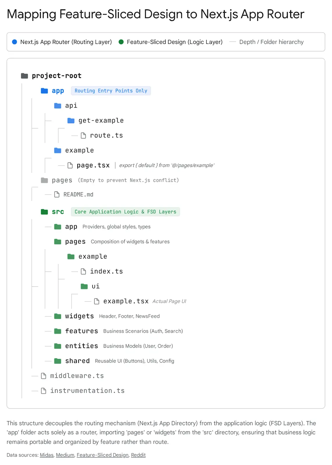
This separation allows for “Colocation”. A feature’s tests, styles, and sub-components live with the feature, not in a global folder. This makes deleting a feature safe and easy, delete the folder, and the code is gone. There is no risk of “orphaned” components lingering in a global components folder.
3. Advanced Component Composition Patterns
With a robust project structure in place, we turn our attention to the micro-architecture of individual components. The goal of reusability is to create components that are rigid in their quality but flexible in their implementation.
3.1 The Polymorphism Challenge
A recurring requirement in modern web design is the “Polymorphic Component”, a single component that adapts its semantic HTML tag based on usage. The classic example is a Button component that sometimes needs to act as a <button> (for actions) and sometimes as an <a> anchor (for links).
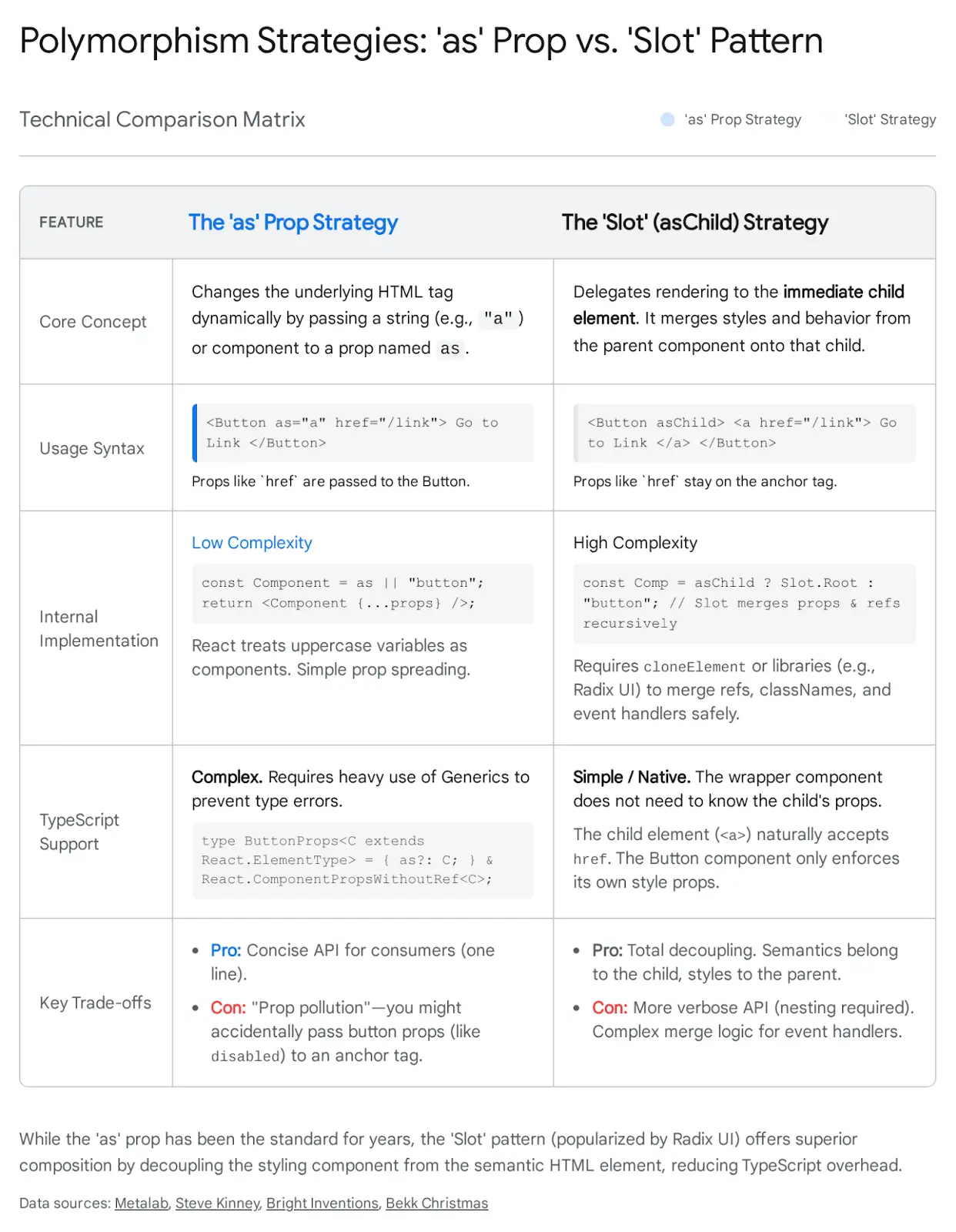
3.1.1 The Legacy “as” Prop Pattern
For years, the standard solution was the as prop.
TypeScript

<Button as="a" href="/login">Login</Button>
While functional, this approach introduces significant complexity, particularly with TypeScript. To type this correctly, one must use complex generics () to ensure that if as=”a”, the component accepts href, but if as=”button”, it rejects href and accepts onClick.16 This often leads to brittle type definitions and massive prop interfaces that are hard to maintain.
3.1.2 The Modern “Slot” (asChild) Pattern
Influenced by libraries like Radix UI, the industry is shifting toward the “Slot” pattern (often implemented via an asChild prop). Instead of the component internally rendering a dynamic tag, it delegates the rendering to its immediate child.
Implementation:
The component checks for the asChild prop. If present, it does not render its own DOM node. Instead, it clones its child (React.cloneElement or a Slot utility) and merges its own props (class names, event handlers) onto that child.
Usage:
TypeScript

// The Button component provides the styling (blue background, padding)
// The anchor tag provides the semantic behavior (navigation)
<Button asChild>
 <a href="/dashboard">Dashboard</a>
</Button>
Why this is superior for Next.js:
- Decoupling: The Button does not need to know about the Link component from next/link. It simply wraps whatever is passed.
- Type Safety: There are no complex generics. The Button only worries about its own props (size, variant). The <a> tag handles its own attributes.
- Composition: It allows for infinite nesting combinations without prop collisions.
3.2 Headless UI: The Separation of Logic and View
Reusability is often hampered by the coupling of “Behavior” (logic) and “Look” (styling). A Dropdown component that is hard-coded with Tailwind classes is useless in a project using Styled Components.
Headless UI solves this by providing components that handle all the complex logic, accessibility (ARIA attributes), focus management, keyboard navigation, but render zero styles.
The Reusability Win:
You can build a “Company UI Kit” that wraps Headless UI primitives.
- Logic Layer: Import Menu from @headlessui/react. It handles the Enter key opening the menu, the Escape key closing it, and focus trapping.
- Style Layer: Apply your company’s branding (CSS Modules, Tailwind, Emotion) to the headless primitives.
This approach ensures that your components are accessible by default (a notoriously hard thing to get right manually) while remaining visually flexible.22
3.3 Compound Components in a Server-First World
The Compound Component pattern (e.g., <Select><Select.Item /></Select>) is beloved for its expressive API. Traditionally, this relied heavily on React.Context to share state (like activeValue) between the parent and children.
The RSC Challenge:
Server Components cannot use createContext or useContext. If you strictly adhere to the traditional pattern, the entire component tree must be marked “use client”, losing the benefits of server rendering for the content.
Server-Compatible Solutions:
- Pure Composition (No Context): If the compound parts are just for layout (e.g., <Card.Header>, <Card.Body>), they don’t need Context. They can remain Server Components that simply render divs with specific classes.
- Context Splitting: For stateful components (like a Tabs system), split the implementation.
- Root: A Client Component that holds the State and Context Provider.
- Leaves: Client Components that consume the context.
- Content: Passed as children (Server Components) into the slots.
This allows the heavy static content inside a tab panel to be rendered on the server, while the tab switching logic remains on the client.
4. Essential UX Patterns in Next.js App Router
The App Router does not just change routing; it enables UX patterns that were previously difficult or impossible to implement performantly. By moving the router to the server, we can orchestrate complex state transitions without bloating the client bundle
4.1 Pattern A: URL-Driven State (The “Deep Link” Pattern)
In Single Page Applications (SPAs), developer instinct is often to reach for useState to control UI elements like search bars, active tabs, or filter panels. In Next.js, this is an architectural anti-pattern for reusability.
The Architectural Shift: Move state from Memory (RAM) to the URL (Query Params).
Why this improves Reusability & UX:
- Shareability: If a user filters a list by “Status: Pending” and “Sort: Date”, the URL reflects this (?status=pending&sort=date). They can copy the URL to a colleague, who sees the exact same state. useState cannot do this.
- Server integration: Server Components can access the searchParams prop. This means the server can fetch the filtered data directly. There is no “loading spinner” while the client reads the state and re-fetches; the page arrives fully formed with the correct data.
Implementation Strategy:
- The Client Component (Writer): The Search Bar or Filter UI. It uses the useSearchParams hook to read current values and useRouter to update them. Crucially, it should use replace (not push) to update the URL without adding to the browser history stack for minor keystrokes.
TypeScript
// search.tsx (Client Component)
'use client';
import { useSearchParams, useRouter, usePathname } from 'next/navigation';

export function Search() {
 const searchParams = useSearchParams();
 const { replace } = useRouter();
 const pathname = usePathname();

 const handleSearch = (term: string) => {
   const params = new URLSearchParams(searchParams);
   if (term) params.set('query', term);
   else params.delete('query');
   replace(`${pathname}?${params.toString()}`);
 };
 //... render input
}- The Server Component (Reader): The Page component accepts searchParams as a prop.
TypeScript
// page.tsx (Server Component)
export default async function Page({
 searchParams,
}: {
 searchParams?: { query?: string; page?: string };
}) {
 const query = searchParams?.query |

| '';

const data = await fetchInvoices(query); // Fetch happens on server!

return ;

}

```
Reusability Insight: This pattern decouples the “Trigger” (Search Input) from the “Consumer” (Table). They don’t need to share a parent state variable or a Context. They communicate via the neutral ground of the URL. You can drop the Search component anywhere in the app, and as long as the page listens to the URL, it works.
4.2 Pattern B: Intercepting & Parallel Routes (The Contextual Modal)
One of the most complex UX patterns to build robustly is the “Route Modal”, where clicking an item opens it in a modal overlay (preserving the context of the list underneath), but refreshing the page or sharing the link renders the item as a standalone full page.
Next.js App Router solves this natively with Intercepting Routes (.)folder and Parallel Routes (@slot).
4.2.1 The Mechanics of Interception
- Parallel Route (Slot): You define a “slot” in your layout, e.g., @modal. This allows you to render the modal simultaneously with the main children.
- Intercepting Route: You create a folder named (.)photos inside the @modal slot. The (.) syntax tells Next.js: “If the user navigates to /photos/1 from within this layout, intercept that navigation and render this component instead of the global page.”
- Hard Navigation Fallback: If the user refreshes the page (or clicks the link from an external site), the interception logic is bypassed. Next.js renders the standard /app/photos/[id]/page.tsx, which is the full-page view.
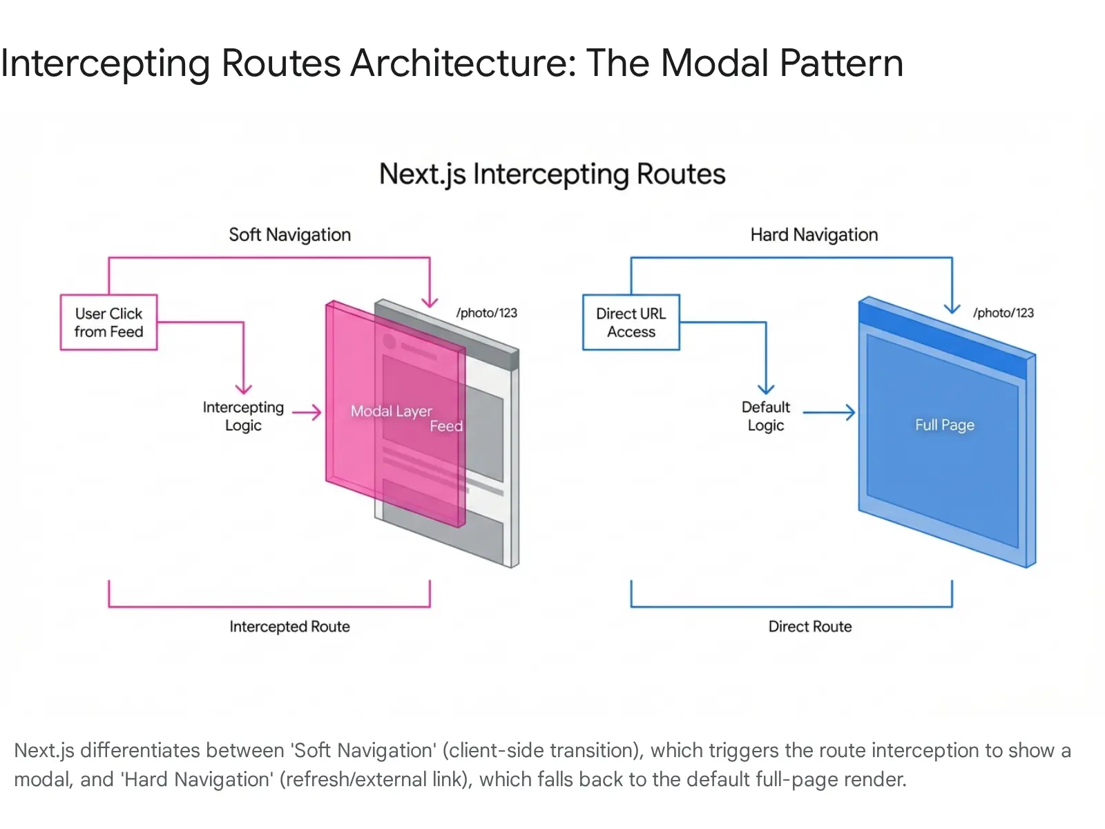
Reusability Benefit:
The logic for “opening in a modal” is entirely removed from the component. The PhotoFeed component simply renders a standard <Link href=”/photos/1″>. It doesn’t know about modals, state, or click handlers. The Router handles the behavior. This makes the PhotoFeed component incredibly reusable and simple.
4.3 Pattern C: Optimistic UI & Server Actions
Users expect instant feedback. Waiting 200ms for a server round-trip to “Like” a post feels sluggish in 2026. Optimistic UI updates the interface immediately, assuming success, and silently rolls back if the server request fails.
Next.js 14/15 introduced the useOptimistic hook to standardize this pattern in conjunction with Server Actions.
4.3.1 The Architecture of Optimism
- State Separation: The component holds a local optimisticState.
- Action Sequence: When the user clicks “Like”:
- Phase 1 (Immediate – Client): Call addOptimisticState(newData). The UI updates instantly (Heart turns red, count +1).
- Phase 2 (Background – Server): Trigger the asynchronous Server Action (incrementLike()).
- Phase 3 (Reconciliation): When the Server Action completes, it calls revalidatePath(‘/posts’). This tells Next.js to re-fetch the route data.
- Phase 4 (Synchronization): The Server Component re-renders with the canonical data from the database. React automatically switches the UI from the “Optimistic State” to the “Server State”. If the canonical data matches the optimistic prediction, the user sees no change. If it differs (e.g., the like failed), the UI automatically corrects itself.
Code Pattern:
TypeScript

// like-button.tsx
'use client';
import { useOptimistic } from 'react';
import { toggleLikeAction } from './actions';

export function LikeButton({ likeCount, isLiked }: { likeCount: number, isLiked: boolean }) {
 // Define the optimistic reducer
 const = useOptimistic(
   { likeCount, isLiked },
   (currentState, optimisticValue) => ({
     likeCount: currentState.isLiked? currentState.likeCount - 1 : currentState.likeCount + 1,
     isLiked:!currentState.isLiked,
   })
 );

 return (
   <form action={async () => {
       setOptimisticState(null); // Trigger optimistic update immediately
       await toggleLikeAction(); // Perform actual server mutation
   }}>
     <button>
       {optimisticState.isLiked? '❤️' : '♡'} {optimisticState.likeCount}
     </button>
   </form>
 );
}
This pattern is highly reusable because it encapsulates the optimistic logic within the interactive island (the button), while relying on the standard Server Action pattern for data persistence.
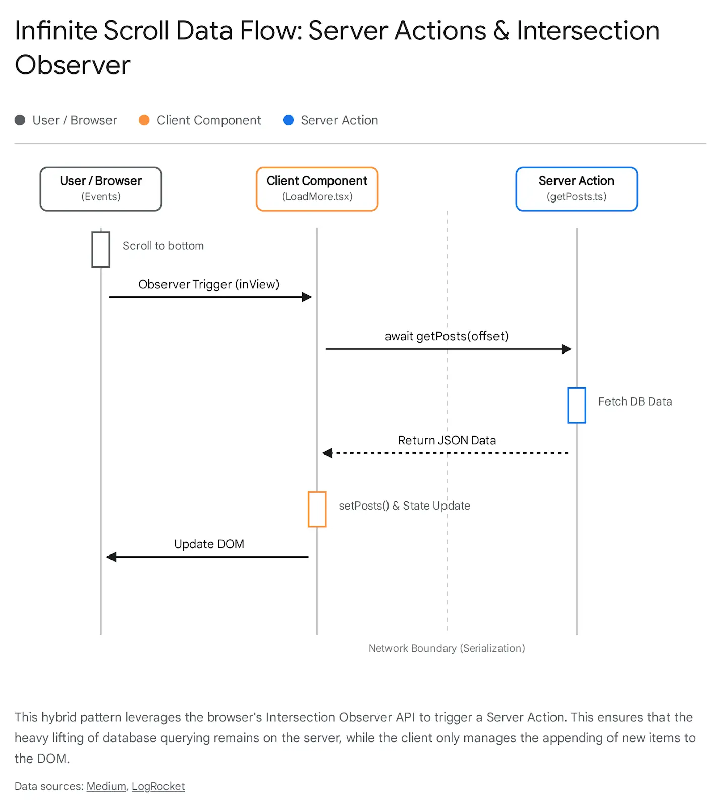
4.4 Pattern D: Infinite Scroll with Server Actions
Infinite scroll has traditionally been a performance bottleneck and an implementation headache, involving complex useEffect chains, manual fetch calls, and client-side state merging. Server Actions allow for a hybrid approach that is more robust and SEO-friendly.
4.4.1 The Hybrid Implementation
The reusable pattern here involves a Server Component that renders the initial list (Page 1) and a generic Client Component (the “Loader”) that detects when the user reaches the bottom of the page.
Mechanism:
- Initial Load (Server): The page.tsx fetches the initial batch of data (e.g., first 10 items) and renders them. This ensures search engines see the content immediately.
- The Trigger (Client): A <LoadMore /> component is placed at the bottom of the list. It uses the IntersectionObserver API to detect visibility.
- The Action (Hybrid): When the trigger becomes visible, it calls a Server Action fetchMorePosts(offset).
- The Update (Client): The Server Action returns the data (JSON). The Client Component appends this new data to its local state list.
Note on Advanced Patterns: In bleeding-edge implementations, Server Actions can return rendered JSX components rather than JSON. This allows the client to simply stream in the HTML without needing to know how to render a “Post Card”, further decoupling the client from the view
logic. However, the JSON-based approach remains the most stable for production reusability today.
5. Streaming and Suspense Architecture
Reusability extends beyond visual components to the loading experience. In the past, every data-fetching component had to manage its own isLoading state, often leading to “spinner hell” or layout shifts.
In the App Router, we use Suspense Boundaries to decouple the fetching logic from the rendering logic.
5.1 Granular Suspense Strategies
Instead of blocking the entire page render while data loads (the old getServerSideProps model), we can wrap independent sections of the UI in <Suspense>.
The Architectural Insight:
- Component Independence: A <CommentsSection> component should initiate its own data fetch internally. By wrapping it in Suspense <Suspense fallback={<CommentsSkeleton />}>, the parent page doesn’t need to await the comments. The main page content renders instantly; the comments stream in when ready.
- Reusable Loading States: Create generic <Skeleton> components (like a gray rectangle with a shimmer animation). These are the visual placeholders passed to the fallback prop.
The loading.js Convention:
Next.js provides a special file loading.js for every route segment. This automatically wraps the page content in a Suspense boundary. This gives you a reusable “App Shell” loading state for free, without writing any manual Suspense code.
Best Practice: Use loading.js for the initial page shell, but use manual <Suspense> boundaries for granular, slower widgets (like stock tickers or third-party integrations) inside the page. This prevents one slow API call from blocking the entire view.
6. Testing and Maintainability in the Hybrid Era
Building reusable patterns is futile if they cannot be maintained or tested. The Server/Client split introduces new testing challenges.
6.1 Testing Server Actions
Server Actions are just asynchronous functions. This makes them surprisingly easy to unit test. You can import them directly into your test files (Jest/Vitest) and call them with mock data, asserting that they return the expected results or perform the expected database mutations. You do not need to spin up a browser or a full React render cycle to test the business logic contained in an action.
6.2 Storybook and RSC
Traditionally, Storybook runs entirely in the browser. This creates a conflict with Server Components that rely on Node.js APIs (like headers or database connections).
- Strategy: For reusable UI components (Buttons, Cards, Inputs), keep them as “dumb” as possible or make them Client Components. Storybook handles these natively.
- Strategy: For Server Components, use the “Container/Presenter” pattern. The Server Component fetches data and passes it to a Presenter (Client) component. You write stories for the Presenter component, mocking the data props. This ensures your visual library remains testable even if the data source is server-bound.
Final Thoughts
The transition to React Server Components and the Next.js App Router is a maturity milestone for frontend development. We have graduated from the era of “everything is a client-side script” to a sophisticated, multi-tiered architecture.
Reusability in 2026 is no longer just about clean code; it is about architectural placement.
- Structure: We have moved from simple Atomic hierarchies to domain-aware Feature-Sliced Design to manage complexity at scale.
- Polymorphism: We have evolved from the fragile as prop to the composable “Slot” pattern, strictly separating semantics from style.
- UX Patterns: We are leveraging the server for what it does best (initial load, heavy computation, data integrity) while reserving the client for what it does best (interactivity, optimistic updates), bridging the two with Server Actions and URL state.
For the modern architect, the key to scalability lies in respecting the Server-Client boundary while treating it as a seamless continuum. By adopting these advanced patterns, teams can build applications that are not only reusable and maintainable but also intrinsically performant by design.