What if your iOS app could automatically adapt to every Apple device without rebuilding layouts for each screen size?
In modern iOS app development, creating seamless user experiences across Apple’s diverse device ecosystem is essential for enterprise success.
Whether customers use your app on iPhone 16, iPad Pro, or Apple Watch, they expect flawless functionality across all platforms.For enterprise leaders, CEOs, and CTOs, this translates directly to user retention and revenue growth.
This guide explores how Swift Size Classes enable adaptive layouts that work perfectly across all iOS devices.It’s a critical foundation that both technical and non-technical founders need when building scalable mobile applications.
With Xcode 16 supporting iOS 18 and Swift 6, Size Classes remain the cornerstone technology for UI adaptability.That makes them crucial for decision-makers and technology leaders planning mobile strategy.
Size classes use the UITraitCollection class with horizontalSizeClass and verticalSizeClass properties to indicate current size class dimensions.
This tutorial guides development teams and startup founders through mastering adaptive layouts using Size Classes.We’ll cover everything from fundamental concepts to advanced techniques.

Whether you’re an experienced iOS developer or a business leader building responsive applications, this guide provides essential knowledge to ensure exceptional experiences across Apple’s device lineup.
What Are iOS Size Classes? Complete Definition and Overview for Enterprise Development
Before diving into practical implementation strategies, let’s establish a clear understanding of Size Classes and their role in creating adaptive iOS interfaces that meet enterprise standards and user expectations.
Understanding Size Classes in iOS Development
 In iOS development, Size Classes provide a systematic approach to categorizing devices based on their screen characteristics. Rather than designing individual layouts for each specific device model – which would be costly and inefficient for organizations with limited development budgets – you create designs for predefined Size Class categories, enabling your interface to adapt intelligently across devices sharing similar traits.
For executive leadership, this means significant cost savings in development time and maintenance, as your team can create one adaptive solution instead of multiple device-specific implementations.
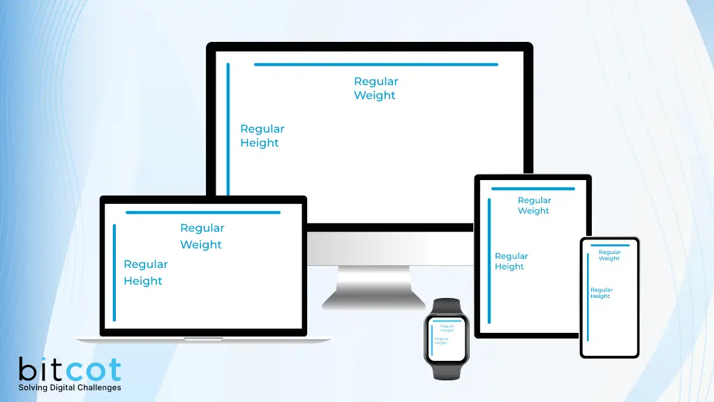
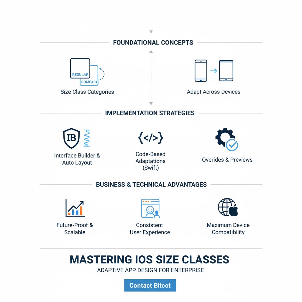
The two fundamental Size Class categories are:
- Regular: Indicates larger screen real estate or landscape device orientation
- Compact: Represents smaller screen dimensions or portrait device orientation
Each iOS device operates within one of four possible Size Class combinations:
- Regular width, Regular height: iPad in landscape orientation, larger iPhone models in landscape
- Regular width, Compact height: iPad in portrait mode, iPhone in landscape orientation
- Compact width, Regular height: iPhone in portrait orientation
- Compact width, Compact height: Smaller devices in specific orientations
Understanding these Size Class characteristics forms the foundation for creating layouts that adapt seamlessly across Apple’s device ecosystem – a critical requirement for corporate applications that must work flawlessly across diverse business device environments.
Why Size Classes Are Essential for Modern Enterprise iOS Apps
Size Classes provide crucial standardization for responsive interface design without requiring extensive device-specific customizations. Here’s why they’re indispensable for C-suite executives and engineering leaders planning modern iOS development:
Business Continuity Across Devices: Size Classes ensure visual and functional consistency across Apple’s device lineup. Navigation elements, buttons, and text components maintain appropriate appearance and behavior regardless of the specific device – crucial for corporate users who may switch between devices throughout their workday.
Development Efficiency and Cost Control: Instead of creating separate interface designs for every device model, engineering teams can streamline their workflow by focusing on key Size Class categories, significantly reducing development time and complexity. For strategic decision-makers, this translates to faster time-to-market and reduced development costs.
Future-Proof Enterprise Architecture: As Apple continues introducing new devices with iOS 18 and beyond, your applications remain adaptable thanks to Size Classes’ flexible framework. This future-proofing is essential for technology executives planning long-term mobile strategies.
User Experience Optimization: Size Classes enable seamless adaptation to device rotation, ensuring optimal user experiences regardless of how users hold their devices – particularly important for business applications used in various work environments.
Working with Size Classes in Interface Builder and Xcode
To effectively implement Size Classes, development professionals will primarily work within Interface Builder, Xcode’s visual design environment. Interface Builder provides intuitive tools for defining how interface elements behave across different Size Classes, simplifying adaptive layout creation.
Within Interface Builder’s canvas, you can select Size Classes from the bottom toolbar of your storyboard. This feature segments your design into variations for different Size Classes, allowing precise customization of interface elements for each category.
By leveraging Interface Builder’s Size Class capabilities, software teams will create dynamic layouts that adapt effortlessly to various iOS devices and orientations, forming the foundation for exceptional user experiences that meet modern business standards.
How to Design Adaptive Layouts for Different iOS Size Classes
Interface Builder, integrated within Xcode, serves as the primary tool for creating adaptive layouts that respond to different Size Classes. Here’s your step-by-step implementation guide for software architects and programmers:
Setting Up Size Class Variations in Interface Builder
- Project Setup: Technical leads should ensure development teams open their Xcode project and navigate to the storyboard or XIB file where they’ll implement Size Class adaptations.
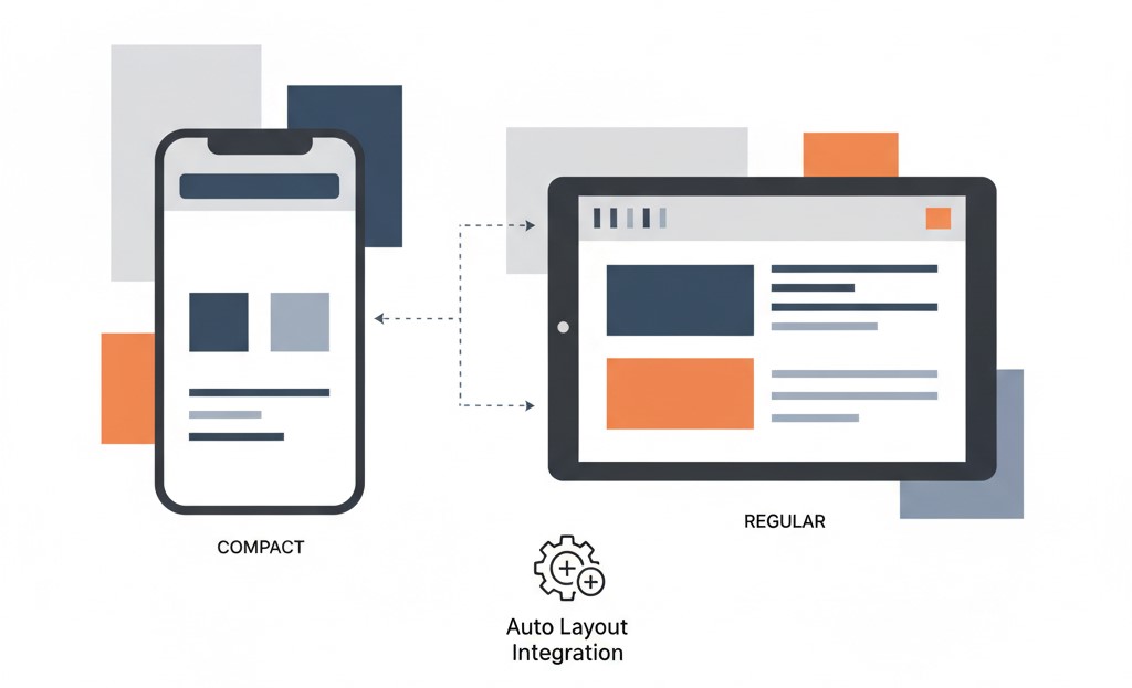
- Size Class Selection: Located at the bottom of Interface Builder’s canvas, developers will find icons representing the fundamental Size Classes: Regular and Compact. Click these icons to customize layouts for each Size Class category.
- Element Configuration: Development teams should drag and drop interface elements onto the canvas for respective Size Classes. For example, implement larger navigation bars for Regular Size Classes (iPad landscape) and compact alternatives for Compact Size Classes (iPhone portrait).
- Auto Layout Integration: Technical teams must utilize Auto Layout constraints to define how interface elements adapt to different screen dimensions and orientations. Interface Builder provides user-friendly tools for adding and modifying these essential constraints.
Best Practices for Auto Layout with Size Classes
Auto Layout serves as your primary tool for designing adaptive layouts with Size Classes. Developers and technical teams should follow these proven strategies:
Size Class-Specific Constraints: Create Auto Layout constraints that apply exclusively to specific Size Classes. Technical teams can establish constraints that adjust element spacing, modify font sizes, or reposition components based on the current Size Class.
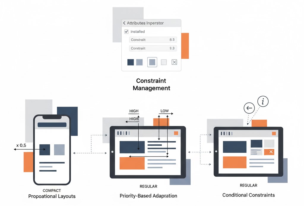
Constraint Management: To implement Size Class-specific constraints, developers select an interface element, open the Attributes Inspector, and enable the “Installed” checkbox for your desired Size Class. Then add or modify constraints according to your design requirements.
Dynamic Adaptation: Technical teams should design constraints that respond intelligently to Size Class changes, ensuring smooth transitions when users rotate their devices or when your app runs on different device types.
Creating Advanced Adaptive Constraints for Size Classes
Developing adaptive constraints represents a crucial aspect of designing layouts that seamlessly respond to different Size Classes. This section explores the detailed process for technical teams and developers implementing constraints that adapt to specific Size Classes, ensuring optimal functionality across iOS devices in enterprise environments.
Implementing Size Class-Specific Auto Layout Constraints
Auto Layout, Apple’s sophisticated layout system, empowers developers and technical teams to create dynamic and responsive interfaces. To implement Size Class-specific constraints:
Element Selection: Developers begin by selecting the target interface element within Interface Builder’s canvas that requires adaptive constraints.
Attributes Inspector Configuration: Within the Attributes Inspector (located in Xcode’s right panel), technical teams locate the “Installed” checkbox option. This critical control determines whether constraints should be active for specific Size Classes.
Size Class Customization: With the “Installed” checkbox selected, developers modify constraints to match your selected Size Class requirements. Adjust properties including constant values, multipliers, or priorities to achieve optimal layout adaptation.
Advanced Constraint Techniques for Different Device Types
Proportional Layouts: Technical teams implement constraints using multipliers to create proportional layouts that scale appropriately across different screen sizes while maintaining design integrity.
Priority-Based Adaptation: Developers utilize constraint priorities to create hierarchical layout systems that gracefully handle conflicting requirements across Size Classes.
Conditional Constraints: Technical teams develop constraint systems that activate or deactivate based on Size Class conditions, enabling dramatically different layouts for different device categories.
Code-Based Size Class Adaptations in Swift
While Interface Builder and Size Class Overrides provide powerful visual design tools, certain scenarios require code-based adaptations to achieve precise control over application behavior across different Size Classes. This section explores implementing programmatic adaptations using Swift for developers and technical teams.
Understanding UITraitCollection for Size Classes
In iOS development, the UITraitCollection class serves as the primary interface for developers understanding and responding to Size Classes programmatically. A UITraitCollection object encapsulates comprehensive information about the device environment, including current Size Class status. Technical teams access the current UITraitCollection through the traitCollection property available on view controllers or views.
Responding to Dynamic Size Class Changes in Swift
Applications often need to respond dynamically to Size Class changes as users interact with your app. Developers implement the traitCollectionDidChange(_:) method in your view controller to handle these transitions:
override func traitCollectionDidChange(_ previousTraitCollection: UITraitCollection?) {
    super.traitCollectionDidChange(previousTraitCollection)

    if traitCollection.horizontalSizeClass != previousTraitCollection?.horizontalSizeClass ||
       traitCollection.verticalSizeClass != previousTraitCollection?.verticalSizeClass {
        // Update UI based on new Size Class
        updateLayoutForCurrentSizeClass()
    }
}
This method activates when devices rotate or when applications run on devices with different Size Classes, providing an ideal location for technical teams to implement dynamic interface updates.
Best Practices for Code-Based Size Class Management
While code-based adaptations offer tremendous flexibility, they can introduce complexity, particularly in larger enterprise projects. Technical teams and developers should maintain clean, organized code by following these established practices:
Code Organization: Group Size Class-related code together for improved readability and maintenance across development teams.
Documentation: Use descriptive comments to explain the purpose and functionality of Size Class-specific code blocks – essential for enterprise development environments with multiple developers.
Code Reusability: Technical teams should avoid duplication by creating functions or methods that encapsulate common Size Class adaptations.
Balanced Approach: Developers should combine code-based adaptations with Interface Builder and Size Class Overrides to achieve optimal balance between visual design tools and programmatic control.
By mastering code-based adaptations, technical teams gain the capability to implement highly customized and responsive layouts tailored specifically to each Size Class, ensuring exceptional user experiences across all iOS devices in enterprise environments.
Size Classes Best Practices for iOS 18 and Swift 6 Development
With the release of iOS 18 and Swift 6 in Xcode 16, several best practices have emerged for enterprise development teams and CTOs implementing Size Classes effectively:
Modern Size Class Implementation Strategies
SwiftUI Integration: Modern iOS development increasingly incorporates SwiftUI alongside traditional UIKit Size Classes, requiring developers and technical teams to understand both paradigms for comprehensive adaptive design.
Performance Optimization: Xcode 16’s improved development tools enable technical teams to create more efficient Size Class implementations with better performance characteristics – crucial for enterprise applications with high user loads.
Device-Specific Considerations: With new device form factors and screen technologies, CTOs and technical leaders must ensure Size Classes account for updated hardware specifications while maintaining backward compatibility across enterprise device fleets.
Professional Development Services: For business leaders, CEOs, and non-technical founders seeking expert implementation of Size Classes and adaptive design, partnering with an experienced iOS app development company like Bitcot can accelerate your project timeline while ensuring best practices are followed throughout the development process.
Testing Size Classes Across Device Simulators
Comprehensive Testing: Technical teams should utilize Xcode’s simulator to test Size Class adaptations across all supported device types and orientations.
Real Device Validation: Developers should supplement simulator testing with real device testing to ensure optimal performance and visual accuracy across enterprise device environments.
Accessibility Integration: Technical leaders must ensure Size Class implementations support accessibility features and dynamic type sizing, meeting enterprise accessibility requirements and compliance standards.
Conclusion: Mastering iOS Size Classes for Adaptive App Design
In today’s competitive iOS development environment, Size Classes have become essential for enterprise success. They provide the fundamental framework for adaptive layouts, enabling development teams to create interfaces that seamlessly adjust across Apple’s device ecosystem.
For CEOs, CTOs, and business leaders, understanding Size Classes represents a strategic advantage, ensuring applications deliver consistent, professional experiences across all devices.
Understanding Size Classes combinations (Regular and Compact categories) is the crucial first step for technical teams, followed by implementation using Interface Builder and Auto Layout. Size Class Overrides streamline customization while providing real-time previews.
Code-based adaptations using Swift add precision, allowing developers to implement specific Size Class behaviors. With iOS 18, Swift 6, and Xcode 16, development continues improving while maintaining core principles for enterprise applications.
Balancing visual design tools with programmatic adjustments ensures applications deliver exceptional experiences across iPhones, iPads, and future Apple devices, creating apps that adapt intelligently while maintaining consistent user experiences.
Enterprise leaders and CTOs can leverage Size Classes to create cost-effective, future-proof mobile solutions that scale with business growth.
Ready to build iOS apps with professional adaptive layouts that meet enterprise standards? Contact Bitcot today to discuss your iOS development project and leverage our expertise in implementing Size Classes for maximum device compatibility, user satisfaction, and business success.