In the ever-evolving world of iOS app development, creating a seamless user experience across a diverse range of Apple devices is not just a luxury but a necessity. Whether your users are on the latest iPhone, an older iPad, or even an Apple Watch, they all expect your app to look and function flawlessly. This is where the concept of adaptive layout comes into play.
Adaptive layout is the art of crafting user interfaces that gracefully adapt to different screen sizes, orientations, and device capabilities. In the realm of iOS development, one powerful tool in achieving this adaptability is Size Classes. They allow developers to design flexible layouts that cater to the unique characteristics of various iOS devices, from the compact iPhone SE to the expansive iPad Pro.
In this blog post, we will embark on a journey into the world of adaptive layout with Size Classes in Swift, Apple’s preferred programming language for iOS development. We will explore what Size Classes are, how to design user interfaces that adapt to them, and how to leverage code to fine-tune the user experience on different devices.
Whether you’re a seasoned iOS developer looking to level up your UI design skills or a newcomer eager to create responsive apps, this guide will equip you with the knowledge and tools needed to ensure your app looks and feels right at home on any iOS device. So, let’s dive into the world of adaptive layout and unlock the potential of Size Classes in Swift.
Understanding Size Classes

What are size classes?
Before we delve into the practical aspects of adaptive layout design, let’s begin by demystifying the concept of Size Classes. These are at the heart of creating layouts that adapt beautifully to different iOS devices.
In iOS development, Size Classes are a way of categorizing devices and their screen sizes. Instead of designing layouts specifically for each individual device, you design for a set of predefined Size Classes, making your interface adaptable to a wide range of devices with similar characteristics.
The two fundamental Size Classes are:
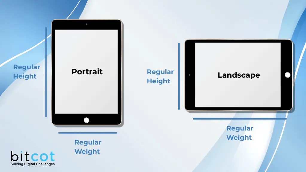
- Regular: Represents a larger screen or a landscape orientation.
- Compact: Represents a smaller screen or a portrait orientation.
Each iOS device falls into one of four combinations of Size Classes:
- Regular width, Regular height (e.g., iPad in landscape)
- Regular width, Compact height (e.g., iPad in portrait, iPhone in landscape)
- Compact width, Regular height (e.g., iPhone in portrait)
- Compact width, Compact height
Understanding the characteristics of these Size Classes is pivotal to creating layouts that adapt seamlessly across various devices.

Why are size classes important?
Size Classes provide a standardized way to design responsive user interfaces without the need for extensive device-specific customization. Here’s why they’re crucial:
- Consistency: Size Classes help maintain visual consistency across devices. Elements like navigation bars, buttons, and text should look and behave similarly across all iOS devices.
- Efficiency: Instead of creating separate UI designs for every device, you can optimize your workflow by focusing on a few key Size Classes, reducing development time and complexity.
- Future-Proofing: As Apple introduces new devices and screen sizes, your app will be better prepared to adapt, thanks to Size Classes.
- Adaptability: Size Classes enable your app to adapt to various device orientations, ensuring a pleasant user experience no matter how users hold their devices.
Size Classes in Interface Builder
To work effectively with Size Classes, you’ll primarily use Interface Builder, the visual design tool within Xcode. Interface Builder allows you to define how your UI elements should behave in different Size Classes, making it easier to create adaptive layouts.
In the Interface Builder canvas, you can select Size Classes from the bottom of the storyboard. This splits your design into variations for different Size Classes, allowing you to tweak your UI elements for each.
By harnessing the power of Size Classes in Interface Builder, you’ll be able to create dynamic layouts that adapt effortlessly to various iOS devices and orientations.
Now that we’ve laid the foundation with an understanding of Size Classes, let’s move on to the practical aspects of designing for different Size Classes and making your app responsive to the diverse iOS ecosystem.
Designing for Different Size Classes
Interface Builder, a visual design tool within Xcode, plays a pivotal role in creating adaptive layouts for different Size Classes. Here’s how to get started:
- Open your Xcode project and select the storyboard or XIB file where you want to work with Size Classes.
- At the bottom of the Interface Builder canvas, you’ll find two icons representing the two fundamental Size Classes: Regular and Compact. Clicking on these icons allows you to customize the layout for each Size Class.
- Drag and drop UI elements onto the canvas for the respective Size Classes. For example, you can add a larger navigation bar for Regular Size Classes (iPad landscape) and a compact one for Compact Size Classes (iPhone portrait).
- Use Auto Layout constraints to define how UI elements should adapt to different screen sizes and orientations. Interface Builder provides a user-friendly interface for adding and editing constraints.
Here’s a simple example of using Interface Builder to adapt a button’s layout:

Auto Layout is your best friend when designing adaptive layouts with Size Classes. Here are some tips:
- Use Auto Layout constraints to specify how UI elements should adapt based on Size Classes. You can create constraints that only apply to specific Size Classes.
- For instance, you can set up constraints that adjust the spacing between elements, change font sizes, or reposition elements based on the current Size Class.
- To create Size Class-specific constraints, select a UI element on the canvas, open the Attributes Inspector, and enable the “Installed” checkbox for the desired Size Class. Then, add or modify constraints as needed.

Designing for different Size Classes with Interface Builder and Auto Layout allows you to create adaptive layouts that enhance the user experience on a wide range of iOS devices. In the next section, we’ll explore how to create adaptive constraints and fine-tune your designs further.
Creating Adaptive Constraints
Creating adaptive constraints is a key aspect of designing layouts that seamlessly adapt to different Size Classes. In this section, we’ll delve into the process of adding constraints that respond to specific Size Classes, ensuring your app looks and functions flawlessly across various iOS devices.
Adding Size Class-Specific Constraints
Auto Layout, Apple’s layout system, empowers you to create dynamic and responsive UIs. To add Size Class-specific constraints:
- Select the UI Element: Begin by selecting the UI element on your Interface Builder canvas that you want to add adaptive constraints to.
- Open the Attributes Inspector: In the Attributes Inspector (located in the right-hand panel of Xcode), you’ll see an option for “Installed.” This checkbox lets you specify whether the constraint should be installed for a particular Size Class.
- Customize Constraints for Each Size Class: With the “Installed” checkbox selected, adjust the constraints to suit the selected Size Class. You can modify properties such as the constant values, multipliers, or priorities to adapt the layout accordingly.
Code-Based Adaptations
While Interface Builder and Size Class Overrides offer powerful visual tools for designing adaptive layouts, there are scenarios where code-based adaptations become necessary to achieve fine-grained control over your app’s behavior on different Size Classes. In this section, we’ll explore how to implement code-based adaptations in Swift.
The Trait Collection
In iOS, the UITraitCollection class is your gateway to understanding and responding to Size Classes programmatically. A UITraitCollection object encapsulates information about the device’s environment, including its Size Class. To access the current UITraitCollection, you can use the traitCollection property of a view controller or view.

Responding to Size Class Changes
In some cases, you may need to respond to Size Class changes dynamically as the user interacts with your app. To do this, you can implement the traitCollectionDidChange(_:) method in your view controller.

This method is called when the device rotates or when the app is run on a different device with a distinct Size Class. It’s a great place to update your UI dynamically.
Complexity and Best Practices
While code-based adaptations offer flexibility, they can also introduce complexity, especially in larger projects. To maintain a clean and organized codebase, consider the following best practices:
- Group code related to Size Class adaptations together for readability.
- Use comments to explain the purpose of Size Class-specific code blocks.
- Avoid duplicating code by creating functions or methods that encapsulate common adaptations.
Code-based adaptations should complement your overall layout strategy. Combine them with Interface Builder and Size Class Overrides to achieve a harmonious balance between visual design and programmatic control.
By harnessing the power of code-based adaptations, you gain the ability to implement highly customized and responsive layouts tailored to each Size Class, ensuring a delightful user experience on every iOS device.
Conclusion
In the ever-evolving landscape of iOS app development, responsive design is essential. Size Classes, the foundation of adaptive layouts, empower developers to craft user interfaces that seamlessly adjust to diverse iOS devices. Understanding Size Classes and their combinations (Regular and Compact) is the first step, followed by designing with Interface Builder and Auto Layout for each Size Class. Size Class Overrides streamline customization, offering real-time previews for distinct scenarios. Code-based adaptations using Swift add precision and control, catering to specific Size Classes. Balancing visual design with code-based adjustments ensures that your app looks and works harmoniously across iPhones, iPads, and beyond, adapting to the evolving iOS ecosystem.


