If you want your iOS app to stand out, you have to do more than make it look good. You need an experience that feels natural, fast, and effortless the moment a user opens it.
That is exactly why Apple’s Human Interface Guidelines (HIG) matter.
They give you the blueprint for building products that feel right on iPhone and iPad, from layout and typography to gestures and navigation patterns.
But here is the problem: most teams treat these guidelines like a rulebook instead of a growth tool. They copy patterns without understanding why they work. As a result, their apps look polished but feel generic. Users bounce, retention drops, and all that time spent polishing pixels stops paying off.
When you know how to use HIG the right way, everything changes. You start designing with intention. Screens become clearer. Interactions feel smoother. Conversions climb because users no longer struggle to understand what to do next.
And the best part? You do not need to reinvent anything. You just need to learn how to apply proven principles in a smarter way.
In this guide, you will get a practical, no-fluff breakdown of the HIG, how they influence real user behavior, and how you can use them to build iOS experiences that perform, not just impress.
Let’s get started.
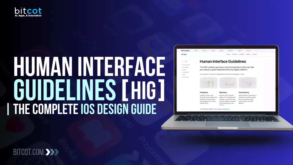
What Are Human Interface Guidelines?
The Human Interface Guidelines (HIG) are a set of principles and recommendations created by Apple to help developers and designers build apps that provide a consistent, intuitive, and high-quality user experience across all Apple platforms (iOS, iPadOS, macOS, watchOS, and tvOS).
Think of the HIG as Apple’s authoritative instruction manual for how an app should look, feel, and behave to be a natural and integrated part of their ecosystem.
Core Definition and Purpose
- Official Design Philosophy: The HIG serves as the definitive source for Apple’s design philosophy. It establishes the core values and standards that should govern every user interaction and visual element within an application.
- Ensuring Consistency: The primary goal of the HIG is to achieve predictability and familiarity. When an app adheres to the guidelines, users don’t have to spend time learning new UI rules. They immediately recognize standard controls (like a back button or a switch) and understand their function, making the app instantly accessible.
- Guiding UI/UX Decisions: The guidelines offer granular, detailed instructions on almost every aspect of the interface, from the correct use of system fonts and colors to the proper implementation of standard and custom gestures, and how feedback (like notifications) should be delivered.
For teams, HIG acts as a shared source of truth. Designers can create consistent layouts, developers know which system components to use, and product managers have a framework to evaluate user experience choices. Instead of debating subjective design opinions, teams can lean on HIG as a well-defined standard.
In a nutshell, Human Interface Guidelines are the blueprint for making your app feel like a natural citizen of the iOS world. They help you design experiences that are beautiful, predictable, efficient, and deeply aligned with how users expect iPhone and iPad apps to work.
Why the iOS HIG Matters for App Success
Following the Human Interface Guidelines isn’t just about pleasing Apple reviewers; it’s a strategic move that fundamentally determines your app’s success, adoption rates, and user satisfaction.
Ignoring the HIG is a common pitfall that can lead to poor user retention and negative reviews.
1. Drives Consistency and Reduces Cognitive Load
The single most critical benefit of adhering to the HIG is consistency.
- Familiarity: Users spend hours every day interacting with Apple’s built-in apps (Mail, Messages, Safari, etc.). They expect a back button to be on the top-left, a tab bar to handle primary navigation at the bottom, and a switch to function in a specific way.
- Zero Learning Curve: When your app uses standard iOS elements and behaviors, users instantly know how to navigate and operate it. This drastically reduces cognitive load, the amount of mental effort required to figure out the app. An app that feels “native” is an app that feels intuitive.
2. Boosts User Trust and Perceived Quality
A non-compliant app often feels clunky, cheap, or even untrustworthy. Conversely, an app that follows the HIG signals professionalism and attention to detail.
- High Quality Perception: Consistent use of Apple’s system font, animations, and established UI patterns makes your app look and feel premium.
- Platform Integration: Following the guidelines ensures your app works seamlessly with core iOS features like Dynamic Type (text sizing), Dark Mode, and Accessibility tools (like VoiceOver). Users expect this integration, and its absence is a mark of poor quality.
3. Essential for App Store Approval
While the HIG is a set of recommendations, strict adherence is practically mandatory for a smooth App Store review process.
- Rejection Risk: Apple’s reviewers will often reject apps that offer a confusing, non-standard, or poor user experience. This includes misusing standard controls or failing to accommodate basic accessibility features.
- Saving Time and Money: Designing according to the guidelines from the start avoids costly revisions, resubmissions, and delays associated with App Store rejection.
4. Future-Proofs Your Design
The HIG evolves with the operating system. By designing with the principles in mind, you are building an app that is structurally ready for future iOS updates.
- Adaptivity: Guidelines for layout and constraints ensure your app automatically adjusts to new screen sizes (like a new iPhone or iPad Pro) and new features (like interactive widgets or the Dynamic Island) with minimal redesign work.
- Maintenance: Developers find it easier to maintain and update code that relies on standard iOS frameworks and components, which are directly informed by the HIG.
In short, the iOS HIG is not a barrier to creativity; it’s a proven roadmap to creating a superior, user-friendly product that aligns with user expectations and Apple’s platform standards.
Core Principles Behind iOS Design
Apple’s contemporary design philosophy, which guides the entire HIG, is now focused on these three powerful and cohesive principles. This framework ensures apps feel integrated, intuitive, and visually unified across all of Apple’s devices and the modern “Liquid Glass” aesthetic.
1. Hierarchy: Elevating and Distinguishing Content
“Establish a clear visual hierarchy where controls and interface elements elevate and distinguish the content beneath them.”
Hierarchy is about organizing your visual elements to prioritize the most important information and actions. This principle directly guides the user’s focus and helps them understand the structure of the app instantly.
- Focus on Content: The most crucial information and media should always be the star. The UI exists only to support it.
- Visual Prioritization: Use size, color, and spacing intentionally. Larger, bolder elements and distinct colors should be reserved for primary actions, while secondary controls should recede.
- Layering and Structure: This is achieved through techniques like blurring, layering, and shadows to clearly show which elements are on top (e.g., a modal sheet) and which are foundational (e.g., the main view).
2. Harmony: Blending Software, Hardware, and System
“Align with the concentric design of the hardware and software to create harmony between interface elements, system experiences, and devices.”
Harmony ensures that your app doesn’t feel like a foreign object but rather a natural extension of the device and the operating system itself. It’s about creating a unified, elegant experience.
- System Integration: This involves using Apple’s system components (like Tab Bars, Toolbars, and system fonts) that automatically adapt to Dark Mode, Dynamic Type, and new materials like Liquid Glass.
- Aesthetic Alignment: The design of the software should reflect the physical design of the hardware. The use of rounded corners, minimal lines, and the new dynamic materials contributes to this seamless look.
- Cohesive Experience: When moving between your app and a system app (like Settings or Messages), the transition should feel seamless and visually consistent.
3. Consistency: Predictability Across the Ecosystem
“Adopt platform conventions to maintain a consistent design that continuously adapts across window sizes and displays.”
Consistency is the principle that makes an app reliable and easy to use. It ensures that learned actions in one part of the system or one app are transferable to another.
- Platform Conventions: Always use standard icons for standard actions (e.g., a magnifying glass for search, a trash can for delete). This is non-negotiable for low cognitive load.
- Predictable Layouts: Place controls where users expect them (e.g., the primary navigation menu at the bottom or left sidebar). Users rely on these predictable patterns.
- Adaptivity, Not Uniformity: Consistency now means the behavior and function of elements remain the same even as their appearance adapts to different contexts (iPhone vs. iPad window size) and different displays (touch screen vs. large monitor).
These principles help you create interfaces that feel familiar, intuitive, and naturally aligned with both the software and the hardware. Understanding them gives you a strong foundation for building beautiful and user-centered iOS experiences.
Design Fundamentals in Apple’s Human Interface Guidelines
When you dive into Apple’s Human Interface Guidelines, the first thing you notice is how much emphasis they place on the basics.
It’s all about setting a strong foundation, so your app feels natural, intuitive, and just right for users.
Let’s break down some key elements you’ll see highlighted in their design fundamentals.
App Icons
Your app’s icon is often the very first impression you make. The guidelines stress that icons should be instantly recognizable, engaging, and visually consistent with the platform. They must look great at all sizes, from tiny notification badges to large icons on the Home Screen and in search results. A great icon should convey the app’s purpose immediately and be aesthetically pleasing.
Color
Color does more than just look pretty; it communicates! Apple emphasizes using color purposefully and consistently to indicate interactivity, status, and hierarchy. This guides designers to make sure their color schemes work well in both Light and Dark Mode and have enough contrast for maximum accessibility.
Materials
This is where things get subtle and elegant. “Materials” refer to the visual depth and appearance of interface elements. This covers things like translucency and blur effects (like the ones you see in sidebars or toolbars) that allow the content beneath to show through. This creates a sense of depth and system-wide harmony.
Layout
A great layout is all about organization and efficiency. The guidelines here tell you how to structure your interface to make primary content easy to find and to ensure the design adapts gracefully to different screen sizes and orientations (think iPhone vs. iPad). Good layout is also about proper alignment and using space effectively to group related items.
Icons
Beyond the main App Icon, this covers the smaller, in-app icons often referred to as SF Symbols. Apple provides a massive library of these symbols, which helps developers maintain a consistent look for common concepts like sharing, adding, or deleting. The guidance focuses on ensuring these icons are clear, legible, and flexible enough to scale and adapt to different contexts.
Accessibility
This is arguably the most important design fundamental. A truly great design is one that everyone can use. This fundamental category covers best practices for making your app usable for people with various disabilities. This includes guidance on using Dynamic Type (letting users adjust text size), providing voiceover support, ensuring sufficient color contrast, and designing intuitive controls.
| Fundamental | Core Focus | Key Consideration |
| App Icons | Instant recognition and engagement. | Must look great and be distinct at all sizes. |
| Color | Communication of status, hierarchy, and interactivity. | Contrast, Light/Dark Mode consistency, and purpose. |
| Materials | Creating depth and system harmony using visual effects. | Translucency, blur effects, and perception of layered content. |
| Layout | Organization, efficiency, and content structure. | Adaptability across various screen sizes and orientations. |
| Icons | Clarity and legibility of internal app symbols and graphics. | Use of flexible, scalable system symbols (SF Symbols). |
| Accessibility | Usability for people with disabilities. | Dynamic Type, VoiceOver support, and sufficient color contrast. |
6 Critical Updates in Apple’s Human Interface Guidelines
The Apple ecosystem is constantly evolving, and the Human Interface Guidelines (HIG) update regularly to reflect major platform shifts and new features.
Their “New and updated” section highlights key areas where designers need to pay attention, often introducing powerful new capabilities or refined interface standards.
Here’s a look at the six current hot topics:
Multitasking
Multitasking has become more sophisticated, especially on iPad and Mac. This guides designers on how to build apps that function seamlessly when sharing screen space with other apps. This includes designing for Split View, Stage Manager, and other windowing environments, ensuring your interface remains legible and usable even when resized or partially obscured.
The Menu Bar
Primarily relevant for macOS, the Menu Bar is a cornerstone of the desktop experience. The updated guidelines cover how apps should effectively use standard menus (File, Edit, View) and how to organize custom commands to maintain a familiar and efficient user experience. This includes best practices for keyboard shortcuts and ensuring commands are clearly categorized.
Toolbars
Toolbars are dynamic areas for quickly accessing common controls and actions. This provides guidance on designing flexible and context-aware toolbars across devices. The focus is often on managing complexity, ensuring controls are visually clear, and prioritizing essential actions so users can operate the app efficiently without clutter.
Search Fields
Search is fundamental to modern app usage. The updated guidance for Search Fields focuses on making the search experience fast, intuitive, and feature-rich. This includes design considerations for integrating voice input (as shown by the microphone icon), providing immediate, useful suggestions, and ensuring the search interface is easily discoverable and accessible within the app’s overall layout.
Game Center
As Apple continues to emphasize gaming across its platforms, Game Center integration is vital for social interaction and user engagement in games. The guidelines here detail how to properly integrate Game Center features like leaderboards, achievements, and multiplayer capabilities, ensuring these social elements enhance the gaming experience without being intrusive.
Generative AI
This is one of the most significant new topics, reflecting the rise of machine learning and artificial intelligence capabilities integrated into apps. This guides designers on how to responsibly and transparently incorporate AI-powered features, like text generation or image creation, into their user flows. The key focus is on managing user expectations and clearly communicating.
| Topic | Primary Focus | Key Design Consideration |
| Multitasking | Designing for adaptive windowing, like Stage Manager and Split View. | Ensuring the UI scales gracefully, and the user context is preserved when the app is resized. |
| The Menu Bar | Structuring primary app commands in the macOS desktop environment. | Proper categorization of menus (e.g., File, Edit) and efficient use of keyboard shortcuts. |
| Toolbars | Providing clean, contextual access to common controls and actions. | Managing complexity, ensuring visual clarity, and prioritizing essential controls. |
| Search Fields | Enhancing the search experience with speed, responsiveness, and rich features. | Integrating voice input, providing immediate suggestions, and making the search function easily discoverable. |
| Game Center | Seamlessly integrating social engagement, achievements, and player motivation features. | Non-intrusive presentation of leaderboards and social elements that enhance the gaming experience. |
| Generative AI | Guiding the responsible and transparent inclusion of AI-powered features. | Maintaining user control and clearly communicating when AI is assisting or generating content. |
How to Apply Human Interface Guidelines to Your iOS App in 5 Steps
Applying the HIG successfully is less about strict obedience and more about strategic integration. It’s about leveraging a proven blueprint to build an experience that feels natural, fast, and effortless for the user.
Here are the 5 critical steps to apply the HIG to your iOS app development process:
Step 1: Start with the Core Principles, Not the Pixels
Before mocking up a single screen, internalize the three core principles that guide the entire iOS design philosophy: Hierarchy, Harmony, and Consistency.
- Hierarchy means prioritizing your most important content and actions. Ask: What is the user trying to achieve on this screen, and how can the UI recede to let that content shine?.
- Harmony means ensuring your app feels like a natural extension of the iOS device. Use system components, rounded corners, and dynamic materials so your app aligns aesthetically with the operating system.
- Consistency ensures that standard actions and controls behave as users expect. Never reinvent the wheel for standard elements like the back button or a search icon.
Step 2: Adopt System Components First
The easiest way to achieve the consistency and platform integration that boosts user trust is by using Apple’s built-in components.
- Use SF Symbols for in-app icons instead of custom graphics. This ensures your icons are clear, legible, and scale correctly.
- Implement standard navigation like the Tab Bar (for primary, five-or-fewer destinations) and Navigation Bar (for hierarchical movement).
- Rely on system frameworks for features like notifications, activity sheets, and text input. Developers find it easier to maintain and update code that uses these standard components.
Step 3: Design for Adaptivity and Accessibility
A modern iOS app must gracefully handle a wide range of devices and user needs.
- Prioritize Layout and Constraints so your design automatically adjusts to new screen sizes (iPhone, iPad, Split View) and orientations. This “future-proofs” your design.
- Support Dynamic Type to allow users to scale the text size. This is a key accessibility feature and is often mandatory for App Store approval.
- Check Color Contrast to ensure your design is legible for all users, especially those with vision impairments, and works effectively in both Light and Dark Mode.
Step 4: Test the “Native” Feel and Reduce Cognitive Load
The true test of a successful HIG implementation is how quickly a new user can understand and operate your app, the “zero learning curve”.
- Conduct usability tests specifically focused on how intuitive the navigation and controls feel. Does the app feel “native” and predictable?
- Avoid “Clunky” Overlays: If your custom UI deviates from the standard iOS look, users may perceive your app as feeling “cheap” or untrustworthy.
- Confirm predictable behavior for every interaction. For example, swiping a list item should reveal contextual actions, and tapping a setting should lead to a detail view.
Step 5: Embrace HIG as a Growth Tool, Not a Rulebook
Instead of treating the guidelines as rules to copy without thought, use them as a framework for informed decision-making.
- Design with intention. Screens should be clearer, and interactions should feel smoother.
- Focus on the Why: Understand that using a standard tab bar works because it aligns with user expectations for primary navigation. This deeper understanding allows you to apply principles in a smarter way, leading to higher conversions and retention.
By following these steps, you transform the HIG from a compliance checklist into a strategic design advantage that builds better, more performant iOS experiences.
Practical Tips for Designing with Human Interface Guidelines
Following the Human Interface Guidelines is a practical discipline that separates generic apps from those that truly perform. It’s about optimizing the user experience for peak efficiency and emotional connection.
Here are practical, actionable tips to incorporate the HIG into your daily design and development workflow:
Focusing on Content and Hierarchy
- Use Typography to Guide Focus: Instead of custom font families, lean into Apple’s system font, SF Pro. Use its various weights, sizes, and styles to establish a clear visual hierarchy. Larger, bolder text should be reserved for titles and primary data points, pushing secondary information into the background.
- Whitespace is an Action: Don’t just fill space. Use generous, consistent whitespace (padding and margins) to visually group related elements and separate distinct sections. This reduces clutter and makes the main content the “star” of the screen.
- Reserve Color for Action: Limit the use of your brand’s primary color to interactive elements (buttons, links, switches). This trains the user to recognize that any element in that color is clickable, which directly communicates interactivity and status.
Achieving Harmony and System Integration
- Leverage Blurring and Translucency: Implement the ‘Materials’ concept by using blur effects for elements like sidebars or toolbars. This creates a system-wide harmony by hinting at the underlying content, adding depth, and making your app feel intentionally layered.
- Test in Dark Mode Early and Often: Don’t treat Dark Mode as an afterthought. Design your color scheme to use “system colors” that automatically adjust. Test your interface with both light and dark settings simultaneously to ensure all elements maintain sufficient contrast and visual appeal.
- Integrate Core Platform Features: Use features like Handoff, Shared with You, or the Dynamic Island when contextually relevant. By supporting these features, you ensure your app is deeply integrated into the iOS ecosystem, which users expect and value.
Practicing Consistency and Usability
- Don’t Break Standard Gestures: If a user can swipe right to go back in one screen, they should be able to do it in all applicable screens. Consistency isn’t just visual; it’s behavioral. Violating standard gestures increases cognitive load and causes friction.
- Use Standard Icons (SF Symbols) with Purpose: When using SF Symbols, ensure the symbol you choose accurately represents the function. For instance, use the standard trash. fill for deletion. This minimizes confusion, as users recognize these symbols instantly across the entire platform.
- Design for Thumb Reach: When designing for iPhone, place primary actions (like a Tab Bar) along the bottom of the screen where they are most accessible to the user’s thumb. Secondary, less frequent controls can be placed in the Navigation Bar at the top. This improves efficiency and one-handed usability.
- Optimize Search Fields for Speed: Adopt the guidelines for Search Fields by including features like immediate, contextual suggestions, and easily discoverable voice input. A fast, responsive search experience is fundamental to a user-friendly app.
By making these practical HIG principles a part of your development checklist, you will transition from merely “polishing pixels” to designing with intention, leading directly to higher retention and user satisfaction.
Quick HIG Compliance Checklist for Product Teams
If you’re trying to make sure your app feels right at home on iOS, running through a quick HIG (Human Interface Guidelines) check can save you from a lot of back-and-forth later.
Here’s a simple, business-friendly rundown to keep your design and dev teams aligned.
1. Make sure your icons match the native iOS style
Apple users have very specific visual expectations. Clean lines, consistent weights, and familiar shapes help your app feel instantly trustworthy. If an icon looks “off,” users notice, and so does the App Review team.
The fastest way to create friction is by inventing your own navigation rules. Stick to what iOS users already understand: the Tab Bar for primary sections, the Navigation Bar for hierarchy, and native sheets or modals for tasks. Familiar patterns = lower cognitive load and faster adoption.
3. Verify accessibility essentials: Dynamic Type, contrast, and labels
Apple heavily prioritizes accessibility, and so do many users. Make sure text scales with Dynamic Type, colors pass contrast checks, and elements have clear accessibility labels. Not only does this improve usability, but it also widens your reachable audience.
4. Review spacing, alignment, and layout responsiveness
iOS thrives on clean, breathable layouts. Before you ship, scan screens for awkward spacing, visual clutter, or misaligned elements. And don’t forget to test across device sizes, what looks great on an iPhone 15 Pro might feel cramped on an SE.
5. Ensure gestures behave the way users expect
People rely on muscle memory. Swipes, taps, and long-presses should behave exactly like they do in other iOS apps. If you override a common gesture without a good reason, users will feel it immediately.
Common HIG Mistakes and How to Avoid Them
Even well-intentioned teams can slip into design habits that feel “creative” but end up clashing with Apple’s Human Interface Guidelines.
The good news?
Most HIG issues are totally preventable once you know what to look out for.
Here are some of the most common pitfalls, and how to steer clear of them.
1. Creating custom gestures that users may never discover
It’s tempting to invent slick, unique gesture interactions, but if users can’t easily find or understand them, they won’t use them. iOS users rely on familiar patterns, so when you hide functionality behind unconventional gestures, you increase friction and risk key features going unnoticed.
2. Skipping Dynamic Type or forgetting about Dark Mode
These aren’t “nice-to-haves”; they’re expectations. When text doesn’t scale with user settings, or when a screen glares in Dark Mode, the experience feels broken. Supporting these system features not only improves accessibility but also gives your app a polished, platform-native feel.
3. Allowing poor color contrast to creep in
Low contrast is one of the top accessibility issues teams overlook. If text blends into the background or UI elements aren’t distinguishable, readability plummets. And that leads to user frustration fast. A quick contrast check early in the design phase can eliminate this completely.
4. Putting primary actions where thumbs can’t comfortably reach
With today’s larger devices, touch ergonomics matter more than ever. When your main actions sit too high or too far from the natural thumb zone, users have to stretch, or worse, adjust their grip. That slows them down and makes the app feel less intuitive.
Partner with Bitcot to Design and Build Your Custom iOS App
Building an exceptional iOS app requires more than just skilled coding; it demands a deep, practical understanding of Apple’s Human Interface Guidelines and how they influence user behavior.
This is where a strategic development partner makes all the difference.
Bitcot specializes in transforming your app concept into a high-performance, native iOS experience that adheres to the highest standards of the HIG.
We treat the guidelines not as a rigid rulebook, but as the blueprint for building a mobile app that feels natural and effortless on iPhone and iPad.
- Native-First Development: We prioritize the use of standard system components and frameworks, ensuring your app feels instantly familiar and trustworthy to the end-user. This approach drastically reduces the cognitive load required for users to learn your app.
- App Store Approval Confidence: Our UI/UX process is built around avoiding the common pitfalls of App Store rejection. By strictly adhering to best practices for UI/UX, accessibility (like Dynamic Type and VoiceOver), and platform integration, we ensure a smoother, faster review process.
- Future-Proof Design: We implement layouts and constraints that follow HIG’s adaptivity principles, ensuring your application gracefully handles new screen sizes, orientations, and future iOS updates (like interactive widgets or new Multitasking features) with minimal maintenance.
Choosing Bitcot means choosing a team that designs with the intention of making screens clearer, interactions smoother, and conversions higher.
We bring the practical know-how to apply proven principles in a smarter way, ensuring your app doesn’t just impress, but truly performs.
Final Thoughts
At the end of the day, the Human Interface Guidelines aren’t just rules to follow; they’re your roadmap to creating iOS apps that users actually enjoy.
When you take the time to understand why certain patterns exist, you don’t just make things look pretty; you make them work. And in the world of mobile apps, working well is everything. Users may forgive a slow loading time or minor bugs, but confusing navigation or inconsistent interactions will make them uninstall in seconds.
Remember, great design isn’t about copying what’s already out there. It’s about using proven principles to make your app feel intuitive, polished, and a joy to use.
Small tweaks in layout, typography, or gestures can dramatically improve usability and engagement. When your app feels intuitive, polished, and enjoyable, it builds trust and keeps users coming back.
If you’re ready to take your app ideas to the next level, Bitcot can help. With our custom iOS app development services, we turn your vision into a high-performing, user-friendly app that stands out in the App Store. Let’s create something your users will love.
Get in touch with our team.

