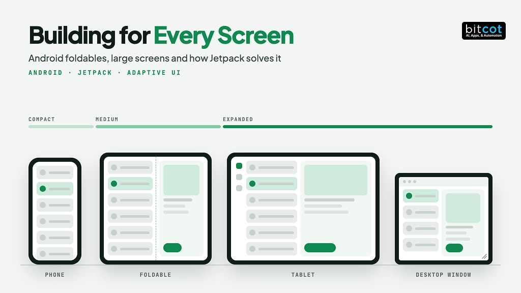
Key Takeaways
- Play requires targeting Android 17 in August 2027, per Google.
- Android 17 removes the orientation and resizability opt-out on large screens.
- NavigationSuiteScaffold defaults to a bar when compact, a rail otherwise.
- Irvine and Long Beach teams should audit tablet workflows screen by screen.
- Treat adaptive support as a staged release gate, not a redesign.
Portrait-only Android apps now have a deadline. Google says Play will require new apps and updates to target Android 17 in August 2027, and that target level removes the opt-out that let an app stay phone-shaped on tablets and Android foldables. The real question is no longer how Jetpack’s adaptive libraries work; it is the order in which your team adopts them and how you prove each screen passes.
Picture an Irvine home-health startup whose caregiver app lives on shared tablets in client homes, locked to portrait since its first release. The day the team raises its target level, the app rotates, stretches, and drops a half-written visit note when a caregiver turns the tablet. Nothing about the design changed; the assumption underneath it did.
This guide covers what changes in Android 16 and 17, the failures that follow, the Jetpack pieces that fix them, and a three-stage plan with a screen-by-screen audit your team can run before the deadline. It also corrects two details that older tutorials still repeat about recomposition and navigation defaults.
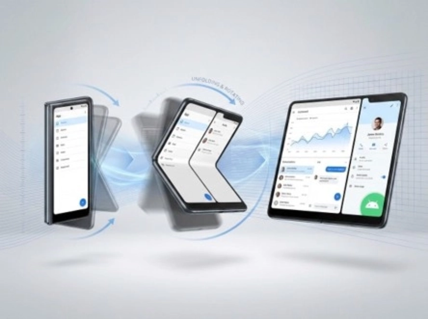
The foldable on the right is the odd one out: it changes shape while the app is open.
What Changes for Android Foldables and Large Screens in 2026?
For apps that target Android 17 (API level 37), orientation locks, resizability opt-outs, and aspect-ratio limits stop working on large screens, and Google Play will require that target level for new apps and updates in August 2027. A large screen here means a display whose smaller dimension is at least 600dp, so tablets, unfolded foldables, and desktop windows all count.
According to Google’s Android Developers Blog, Android 16 introduced the change with a temporary opt-out, and Android 17 removes that opt-out for apps that target API 37. An app that opted out at API 36 feels the change only once it raises its target.
| Manifest attribute or API | Effect on large screens at API 37 |
|---|---|
| screenOrientation | Portrait and landscape values, including reverse, sensor, and user variants, are ignored |
| setRequestedOrientation() | The same orientation values are ignored at runtime |
| resizeableActivity | All values are ignored, so the app is resizable |
| minAspectRatio and maxAspectRatio | All values are ignored |
Two exceptions remain. Screens smaller than 600dp keep honoring your requests, and apps categorized as games through android:appCategory are exempt. Users can also opt in to an app’s requested behavior from the per-app aspect ratio settings.
The direction is consistent across the platform: apps are expected to adapt to whatever window they are given, a shift that sits squarely inside current software development trends. Treat the August 2027 date as a planning input, because raising a target level late compresses every fix into one release.
Why Do Phone-Only Layouts Break on Android Foldables and Tablets?
Phone-only layouts break because they assume the window is fixed, and on foldables and tablets the window changes size, shape, and orientation while the app is open. Eight failures follow from that single assumption.
- The window changes while the app runs. Unfolding, rotating, splitting the screen, or dragging a desktop window all change the available space. An app that reads the size once at launch keeps showing the wrong layout.
- Layouts stretch. Cards, buttons, and text fields set to fill the width run edge to edge on a tablet, and lines of text become too long to read. Capping component width fixes it.
- Actions fall offscreen. In landscape on a short window, a Save or Login button at the bottom can render beyond the visible area. If the container does not scroll, the user is blocked.
- State disappears. By default a configuration change destroys and recreates the activity, so unsaved form text, scroll position, and navigation history vanish unless the app preserves them.
- Folds and postures are ignored. A separating fold can cut a button or a video in half, and a half-opened device in tabletop posture deserves a different layout than the same device fully open.
- Navigation stays phone-shaped. A bottom bar sits far from the thumbs on a wide display and wastes space. List screens that open full-screen details also waste the room to show both.
- Input beyond touch is missing. Keyboards, mice, trackpads, and styluses call for shortcuts, hover states, right-click menus, and drag and drop.
- Camera previews distort. Apps that assume a fixed relationship between sensor orientation and device orientation show stretched, rotated, or cropped previews on landscape foldables and in multi-window.
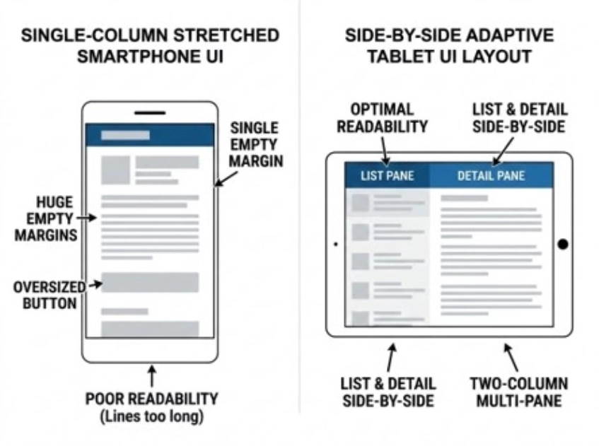
Same screen, same content: the right-hand design simply uses the extra width.
None of these failures is exotic, and all of them are easier to fix before release than after. The pattern of untested assumptions is one of the recurring themes in why software projects fail.
How Do Window Size Classes Decide the Layout?
Window size classes group the width of the current window into named buckets, and your app picks one layout per bucket instead of checking exact pixels. Because the class describes the window rather than the device, it behaves the same in split screen, on a foldable, or in a resized desktop window.
| Size class | Width | Typical window |
|---|---|---|
| Compact | Under 600dp | Phone in portrait, folded foldable |
| Medium | 600dp to under 840dp | Small tablet, unfolded foldable in portrait |
| Expanded | 840dp to under 1200dp | Tablet in landscape, large unfolded foldable |
| Large | 1200dp to under 1600dp | Desktop window, connected display |
| Extra-large | 1600dp and above | Very wide external displays |
According to Google’s WindowManager 1.5 announcement, Large covers widths from 1200dp to 1600dp and Extra-large covers 1600dp and above, and WindowManager calculates them from the BREAKPOINTS_V2 set. Current Compose Material 3 Adaptive releases expose the same classes through currentWindowAdaptiveInfoV2().
val adaptiveInfo = currentWindowAdaptiveInfoV2()
val windowSizeClass = adaptiveInfo.windowSizeClass

if (windowSizeClass.isWidthAtLeastBreakpoint(WindowSizeClass.WIDTH_DP_EXPANDED_LOWER_BOUND)) {
    TwoPaneLayout()
} else {
    SinglePaneLayout()
}
A common claim is that Compose swaps layouts on unfold with no restart. That holds only after you opt out of activity recreation; by default, Android destroys and recreates the activity on a configuration change. Either way, state has to survive, which is why the state tools below matter as much as the layouts.
Which Jetpack Pieces Fix Which Problem?
Jetpack solves large-screen problems with a set of libraries rather than one tool: window size classes choose layouts, Material 3 adaptive scaffolds arrange panes, WindowManager reports folds, and the state libraries protect user progress. Each row below pairs a failure from the previous section with its fix.
| Challenge | Jetpack answer |
|---|---|
| Window changes at runtime | Window size classes through currentWindowAdaptiveInfoV2(), with recomposition when recreation is opted out |
| Stretched layouts | Maximum widths with widthIn, plus ListDetailPaneScaffold and SupportingPaneScaffold |
| Actions falling offscreen | Scrollable containers with the verticalScroll modifier |
| Lost state | ViewModel, rememberSaveable, and SavedStateHandle |
| Folds and postures | WindowManager FoldingFeature, collectFoldingFeaturesAsState(), and windowPosture.isTabletop |
| Phone-shaped navigation | NavigationSuiteScaffold, which uses a bar or a rail by default |
| View-based apps | SlidingPaneLayout and Activity Embedding |
| Camera previews | CameraX PreviewView or CameraViewfinder |
| Testing many sizes | Resizable and foldable emulators, DeviceConfigurationOverride, and Compose UI Check |

ListDetailPaneScaffold shows a list and its detail side by side on wide windows and one at a time on a phone, with correct back behavior. SupportingPaneScaffold pairs a main area with a helper panel, such as a document beside its comments. A developer writes each pane once, and the scaffold decides how many fit.
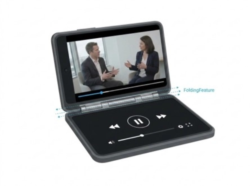
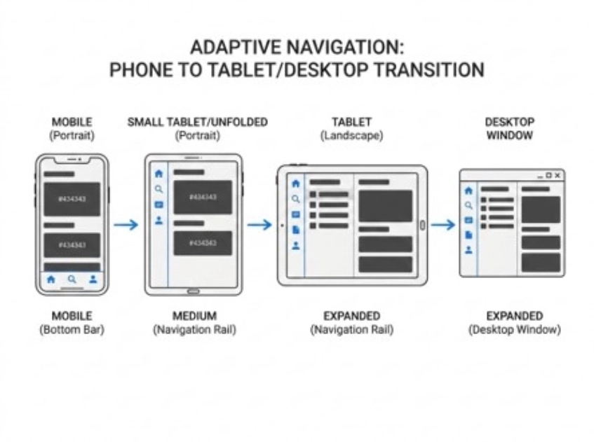
Navigation moves from a bottom bar to a rail as the window grows. A drawer is a customization, not the default.
According to Google’s adaptive navigation guide, NavigationSuiteScaffold shows a navigation bar when the window is compact in width or height or the device is in tabletop posture, and a navigation rail for everything else. A drawer appears only when you set one, so an expanded window gets a drawer by choice rather than by default.
Fold and posture awareness
WindowManager reports a FoldingFeature with four facts: its state (FLAT or HALF_OPENED), its orientation (HORIZONTAL or VERTICAL), its occlusionType (NONE or FULL), and whether it is separating. Together they tell the app where the hinge sits and whether it divides the screen into two usable areas.
A half-opened foldable always reports a separating fold, because the screen splits into two display areas. A horizontal half-open fold is tabletop posture, where a video can sit above its controls, and a vertical one is book posture, suited to two-page layouts. In Compose, collectFoldingFeaturesAsState() delivers these values, and windowPosture.isTabletop gives a shortcut for the tabletop case.
The dashed line is the fold: WindowManager tells the app where it is, so nothing important sits on it.
State that survives resizing
ViewModel keeps screen data alive across configuration changes, rememberSaveable keeps small UI state such as typed text and scroll position through recreation, and SavedStateHandle lets a ViewModel recover after process death. The test is simple: unfold the device halfway through typing a message and confirm the text is still there. If it is not, no layout work matters yet.
Apps still built on Views
XML and View-based apps do not need a rewrite to improve. SlidingPaneLayout gives a responsive two-pane layout that collapses on small screens, Activity Embedding shows two activities side by side on large screens through configuration, and width-qualified resources such as layout-w600dp adapt layouts by width.
When a View-based codebase also carries older architecture, treat the adaptive work as one stream inside a wider legacy system modernization effort rather than a separate project. Sequencing both together avoids touching the same screens twice.
Input and camera
Compose supports keyboard shortcuts, focus handling, hover and pointer events, and drag and drop, which is what makes an app feel at home on a Chromebook or a tablet with a keyboard. Camera screens need extra care, because preview code that assumes a fixed sensor and device orientation shows stretched or rotated previews on landscape foldables and in multi-window. CameraX’s PreviewView handles scaling, rotation, and orientation for you, and CameraViewfinder serves Camera2 codebases.
How Should You Roll Out Adaptive Support Before API 37?
Roll out adaptive support in three stages that mirror Google’s quality tiers: make every screen survive resizing, give wide windows a better layout, then add posture and input features where the product earns them. Each stage ends with a test the team can run, so progress is measurable.
- Stage 1: Survive any window (Adaptive ready). Remove orientation and resizability locks, cap component widths, make containers scrollable, preserve state through recreation, and fix camera previews. Done when no screen is letterboxed, stretched, or unreachable at any size.
- Stage 2: Use the space (Adaptive optimized). Add window size classes, list-detail or supporting-pane layouts on wide windows, adaptive navigation, and keyboard, mouse, and stylus support. Done when each primary flow has a deliberate layout for Compact, Medium, and Expanded.
- Stage 3: Earn differentiation (Adaptive differentiated). Add tabletop and book postures, multi-window and drag-and-drop, and desktop-class layouts for Large and Extra-large windows where they fit the product. Done when a flow works better on a foldable or desktop window than on a phone.
According to Google’s adaptive app quality guidelines, these three tiers are Adaptive ready, Adaptive optimized, and Adaptive differentiated, and apps that complete them can earn a large screen badge on Google Play. The guidelines add that most apps do not need every requirement, so pick the ones that fit your use cases.
Audit one screen at a time
Audit screens, not devices. Pick one revenue-critical flow and run these six checks on each screen in it.
- Rotate twice, fold once. A half-typed form, the scroll position, and the navigation history survive all three changes.
- Resize through the classes. Test windows at Compact, Medium, and Expanded widths, with no stretched buttons or unreachable actions at any of them.
- Check short landscape windows. The primary action is visible or reachable by scrolling.
- Run a keyboard-only pass. Every control is reachable and shows a focus state.
- Check the camera preview. It stays undistorted in landscape and in a resized window.
- Repeat the checks in automated tests. The same sizes run in Compose UI tests, so a regression fails the build.
Use the Pixel Tablet and Pixel Fold emulators in Android Studio, DeviceConfigurationOverride to simulate window sizes in tests, and Compose UI Check to audit layouts for adaptive problems. For an app that does not yet target API 36, the UNIVERSAL_RESIZABLE_BY_DEFAULT compatibility flag previews the new behavior.
Teams that draft tests with AI assistants can generate the size matrix quickly, provided a person confirms each expected result, a practice that fits inside modern AI development workflows. The audit itself stays a human decision.
What users should notice
On a foldable or tablet, an adaptive app switches layouts smoothly, shows more information at once, and keeps what you were doing. An app that still looks like a stretched phone has not adopted adaptive design yet, and feedback to its developer is worth sending.
Which Tablet Workflows in Healthcare and Fintech Break First?
The workflows most exposed are those that run on shared or mounted tablets and depend on typed input: patient check-in, visit notes, and advisor dashboards. Each needs state to survive rotation and layouts that fill a wide window.
Consider a Long Beach clinic whose front desk uses a tablet for check-in. Teams doing patient portal software development for that setting should test the form in landscape first, because an unscrollable container can hide the Submit button.
In healthcare mobile app development, scheduling screens show the opposite problem. A receptionist using appointment scheduling software gains the most from a list-detail layout, seeing the day’s list and the selected visit together on a wide window.
On the fintech side, picture an Oakland credit-union team whose advisors review portfolios on foldables. A supporting-pane layout puts the account on one side and its activity on the other, and tabletop posture suits a video call with the notes below.
Internal tools follow the same logic. Enterprise application development teams should plan these layouts into the first sprint rather than retrofit them after a target level change.
What We Check Before We Call an Android App Adaptive
On the Android app development projects our engineers deliver for California healthcare and fintech teams, the first large-screen failure we find is lost state, not an awkward layout. A caregiver or advisor loses a half-written note on rotation, and trust in the app drops faster than any visual flaw would cause.
At Bitcot, we run the six-check audit on one revenue-critical flow before any redesign, and we write the results into the release notes. For clients in San Diego and Irvine who are replacing paper workflows with tablets, that audit sits inside a wider digital transformation plan. Mobile app design reviews follow the audit, not the other way around.

Conclusion
Android 17 turns adaptive design from a polish item into a release gate with a date: Play requires API 37 in August 2027, and the opt-out for orientation and resizability is gone. The work is manageable when it is staged, with state first, wide-window layouts second, and posture and input features where they fit the product.
Start with one flow and one screen, run the six checks, and let the results set the order of work. Teams in Irvine, Oakland, Long Beach, and the other California cities listed under areas we serve can bring that audit to us.
Frequently Asked Questions
What is an adaptive Android app?
An adaptive Android app adjusts its layout, navigation, and behavior to the window it is given instead of assuming a phone held upright. It uses window size classes to choose layouts, keeps state through resizing, and handles folds and extra input devices where the product benefits. Google’s quality tiers call the basic level Adaptive ready.
What is the difference between window size classes and device type checks?
Window size classes describe the current window, while device type checks describe hardware, so only the former works in split screen, on a foldable, and in desktop windows. A check such as “is this a tablet” breaks the moment the same device is folded or resized. Choose layouts by class, never by device.
How do I make an Android app work on foldables and large screens?
Work in three stages: remove orientation and resizability locks and preserve state, add window size classes with list-detail layouts and adaptive navigation, then add posture and input features where they fit. Test each screen by rotating, folding, and resizing through the size classes. Run the same sizes in automated Compose tests.
How should a California healthcare or fintech team prepare tablet apps for Android 17?
Audit one revenue-critical flow first, such as patient check-in in a Long Beach clinic or an advisor dashboard in an Oakland credit union, and fix state loss and unreachable buttons before redesigning layouts. Then add list-detail or supporting-pane layouts for wide windows. Finish before Play requires API 37 in August 2027.
Do I need to support large screens if my users are on phones?
Yes, because Android 17 ignores orientation and resizability locks on large screens for apps that target API 37, and Google Play will require that target in August 2027. Even a phone-first app can land on tablets, unfolded foldables, and desktop windows. Games and screens under 600dp are exempt, but most business apps are not.